

I’ve often thought that in retirement, when I’m too old to lug heavy camera gear around, I’d relax at home and paint using my extensive library of images as inspiration. Well, although a long long way from retirement, the lack of opportunity to get out with the camera and the urge to try something different has seen me start early.
Why bother?
I wanted a creative outlet that gave me more freedom than that of photography or my job as a designer. I like to think as a photographer I do have a style and I’ve captured some images that perhaps set me apart from others, but there has also be instances where I’ve seen an image almost identical to one I’ve taken. Using a brush, whether a real one or on a computer, offers me greater opportunity for self expression and to create something more unique.
Choosing my medium
I originally planned to use acrylics, but after updating my Wacom Intuos Pro tablet I decided to use Adobe Illustrator, a program I’m used to using through my job as a graphic designer. Part of me still feels like I cheated. It can’t be proper art if I’ve used a computer. But it’s all about making marks at the end of the day, and the way you do it isn’t important, it’s the final result that counts.

Inspiration
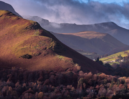
I was loosely inspired by vintage travel posters. I love the idealistic way they depict a destination. One of my first regular destinations as a wildlife photographer was the Farne Islands. With plenty of reference material it seemed like a good place to start.
Adobe Illustrator
I used the mop brush to create the style I was looking for. Using various widths depending on the level of detail I wanted to show. By using global colours and separating different elements onto individual layers I was able to tweak the layout and look as desired.


I like the look straight out of illustrator, but I wanted the finished illustration to have a vintage feel.
Adobe Photoshop

Numerous hue and saturation layers allowed me to tweak the colours, along with a solid yellow colour layer (set to multiply blend mode), which gave a faded paper feel to the image. I also added a vignette and noise to soften the overall look.

The finished file is 100 x 50cm at 300dpi, and will look great printed on an uncoated art paper (once I’ve sourced some). The detail you can see in the close ups will hopefully show through in the final print.

Conclusions
Creating art on the computer means you can always undo what you’ve done if you’re not entirely happy. This is great, but knowing things are relatively easy to change, means it’s hard to know when to stop. This flexibility also means you can extract certain elements to create new artwork; I’m already working on just a portrait of the puffin.
Overall it’s been an enjoyable experience and whilst I’m not about to sell the camera it’s given me another way to express my enjoyment of the outdoors … especially when it’s raining!
You must be logged in to post a comment.